Responsive Web Design

What is responsive web design?

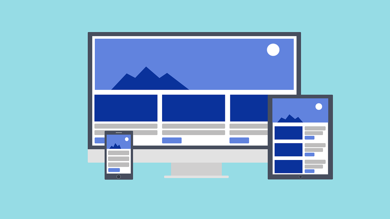
Responsive Web Design illustrates contemporary web design techniques that enable websites and pages to display on any device or screen size by adjusting the screen automatically.

When building a website, responsive web design considers the different categories of devices that a user may use to access the site. Therefore, this results in the display of content on any size of the screen. On the other hand, unresponsive web design maintains the same properties no matter what screen size use.

Rather than focusing on specific display sizes, responsive web code design automatically adapt to a wide range of display sizes, saving web developers time and money. But this is possible to achieve if you have responsive web design services that will make the web designing task easier.

Responsive Web Design

How to find Responsive Web Design Services near me?

Websites can't keep up with the millions of screens on the market. However, this can fulfill through the use of responsive web design.

They mean that your site's pages can adapt and deliver the best experience to users. Whether they're on a desktop, tablet, or mobile phone, this is only possible if your website is responsive.

The responsive web design company generates more leads by taking intelligent steps to reach out to its customers. But, eventually, this becomes the reason for various companies that don't have a responsive web design.

So, to attract customers, compete with other companies and generate leads, every company needs to have a responsive web design. But to get the responsive web design page, it is essential to hire responsive web design servicesresponsive web design services that will help you design the right page.

Wondering, what is responsive web design? How does this responsive web design page work? Keep scrolling down to understand the details about the responsive web design. In addition, this article will help you know the minute details about the same.

The next important thing to look after is the working of responsive web design.

How Responsive Web Design Works?

Percentages are the basis of responsive web design. With the help of professional website design tools, responsive web design services will assign different percentages to the proportions and dimensions of various elements on a web page, such as images, columns, and text boxes. The layout of the responsive website automatically adjusts and scales everything on the original site to fit a mobile user's device screen, thanks to the percentages they assign to these site elements.

Responsive Web Design

Websites may display three columns of information per page on desktop or laptop computers, for example. However, this allows viewers to comfortably view the page's content when viewing the same page on a mobile screen, typically less screen space.

When designing a mobile-friendly website, a responsive web design agency adheres to a few essential responsive web design characteristics. Some of these are:

  1. A flexible grid system is an automatic, responsive Cascading Style Sheets (CSS) grid system with 24 columns.
  2. Flexible images are also known to be adaptive images. For ideas to appear correctly on fixed display size, sizing considerations are required
  3. A media query module allows content to resize to fit the screen.

Above all, to make sure that viewers have the best possible browsing experience, responsive web design testing can use these characteristics.

Why is Responsive Web Design Important?

Do you know why responsive design is vital if you're a beginner in web development or blogging?

I have a simple answer. A single-device approach is no longer sufficient. Mobile web traffic has overload desktop traffic and now accounts for more than 51 percent of website traffic. It's not enough to serve them a page designed for desktop when more than half of your targeted visitors are using a mobile device. As a result, users would have a bad experience.

Today, Mobile has eventually become one of the essential advertising channels in the last few years. As a result, mobile advertising spending is growing by 4.8 percent to $91.52 billion. The majority of your traffic will come from mobile users, regardless of whether you advertise on social media or others.

It's impossible to maximize the ROI of your marketing efforts if your landing pages aren't mobile-friendly and easy to use. For instance, this will result in fewer leads and wasted advertising dollars.

What else can I say?

Mobile users dominate search engine visits. So, to get them to your site, you need a responsive web design that can develop with the help of responsive web design services.

Responsive Web Design

Why You Need Responsive Web Design?

Google and other search engines are a significant source of revenue for many organizations, and they spend a large amount of hard-earned money on advertising each year. Globalization has made it possible to reach a much more comprehensive range of people who use a large category of devices, such as mobile and tablet phones and laptops and desktop computers.

But the reality is many sites still restrict to desktop viewing that keeps you away from reaching out to tabs mobile users. When you consider that most consumers use mobile devices the majority of the time, which makes responsive web design a no-brainer, an affordable mobile-friendly website will benefit both your visitors and Google.

However, it tells you the need to get to the responsive web design page. If you want to earn more, but by saving your valuable time, you must look for creating a responsive web design with the help of responsive web design services. As of now, this will help you to reach out to your potential customers and generate profits.

Ways Responsive Web Design Benefits Your SEO

To generate leads and make your website accessible to your customers on any device, you need a responsive web design page. But this is not it! There are numerous other benefits of using a responsive web design page. Below are the top 5 benefits of using a responsive web design page.

1. Improved Site Usability

If you want your users to be on your site, then easy navigation plays a crucial role. If the user cannot navigate your website, they will certainly not stick to your site.

Responsive web design now makes it simple for the user to navigate and read your website. In addition, it is time-saving and is easily accessible on all devices. However, this is the significant benefit of using responsive web design as it helps in improving usability.

2. Faster Page Speed

The next advantage of using the responsive web design page is that it helps increase the page's speed. The loading time of the page is an easy ranking factor. So, every website must get loaded faster. If your website takes comparatively too long to load, it will also affect the SEO ranking of the page.

Using the responsive web design page will make it easier to get load both on mobiles and desktops, resulting in better experience and ranking.

3. Decreased Bounce Rate

Bounce rate defines as the time-on-site, including the user's time on your site. Therefore, if the user leaves your site quickly, Google records it and considers that the content on your site wasn't relevant.

The content type is not the only thing, but many times the design of the site also plays an important role. For example, your content might be excellent, but the site design doesn't allow the user to reach it, negatively affecting the bounce rate.

If you have a responsive web design page designed by the professionals, it will help reduce the bounce rate.

4. Less Duplicate Content

Those opting for mobile sites can face the issue of duplicate content. However, this might result in giving more time and managing URLs.

If you develop a responsive web design page, it can save you from creating different URLs. So, irrespective of your device, you can escape from the situation of duplicate content

5. Boosted Social Sharing

The reason for creating a responsive web design is to make social sharing easier. However, this is mainly for mobile users. Through social sharing doesn't help the ranking, but it helps in increasing the targeted audience. Above all, Increment in the audience leads to an increase in traffic and engagement.

Conclusion

To sum it up, compared to desktops and laptops, mobile devices use by more people to access the internet today. So, for instance, if you want to be effective on tablet and Smartphone devices, your website must also look great on desktops and laptop computers.

For those who do not yet have a mobile-friendly website, now is the time to look for web design tips and redesign your site. However, this will not only make it simple for you to manage your website, but it will also improve its SEO, conversion rate, and user engagement rate significantly.

Responsive Web Design Services can prove helpful in creating responsive web design pages and attract a more targeted audience.

Call Us Now At +91- 8737081488 to Discuss Your Growth Strategy.

Contact Us

Leave a Reply